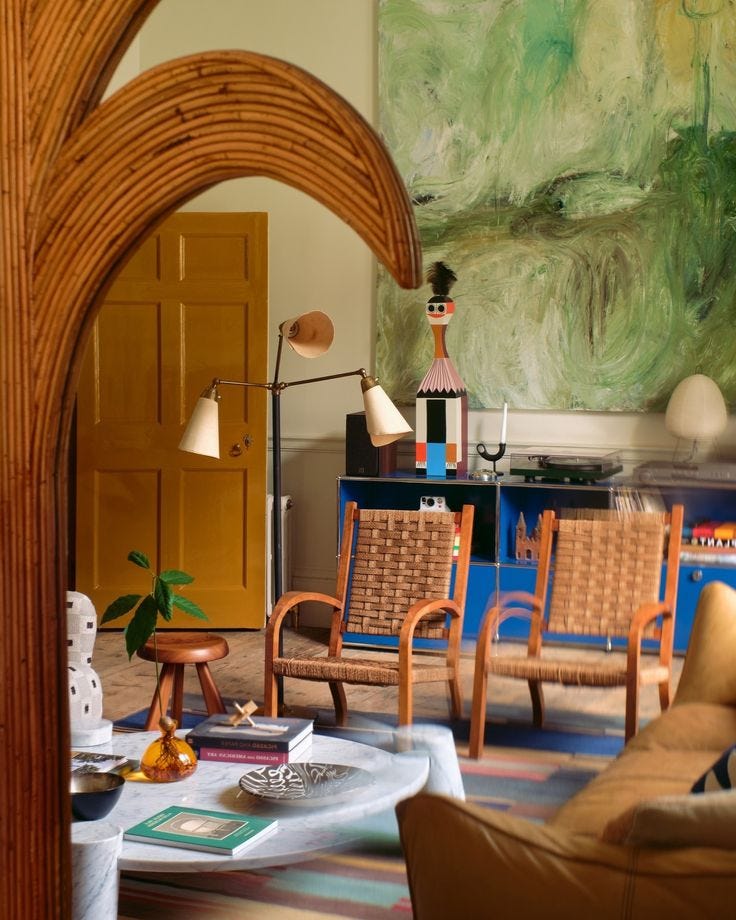
The Perils of the 'Too Perfect' Room
Breaking free from the cookie cutter room, plus 10 lovely homeware bits I've seen this week...
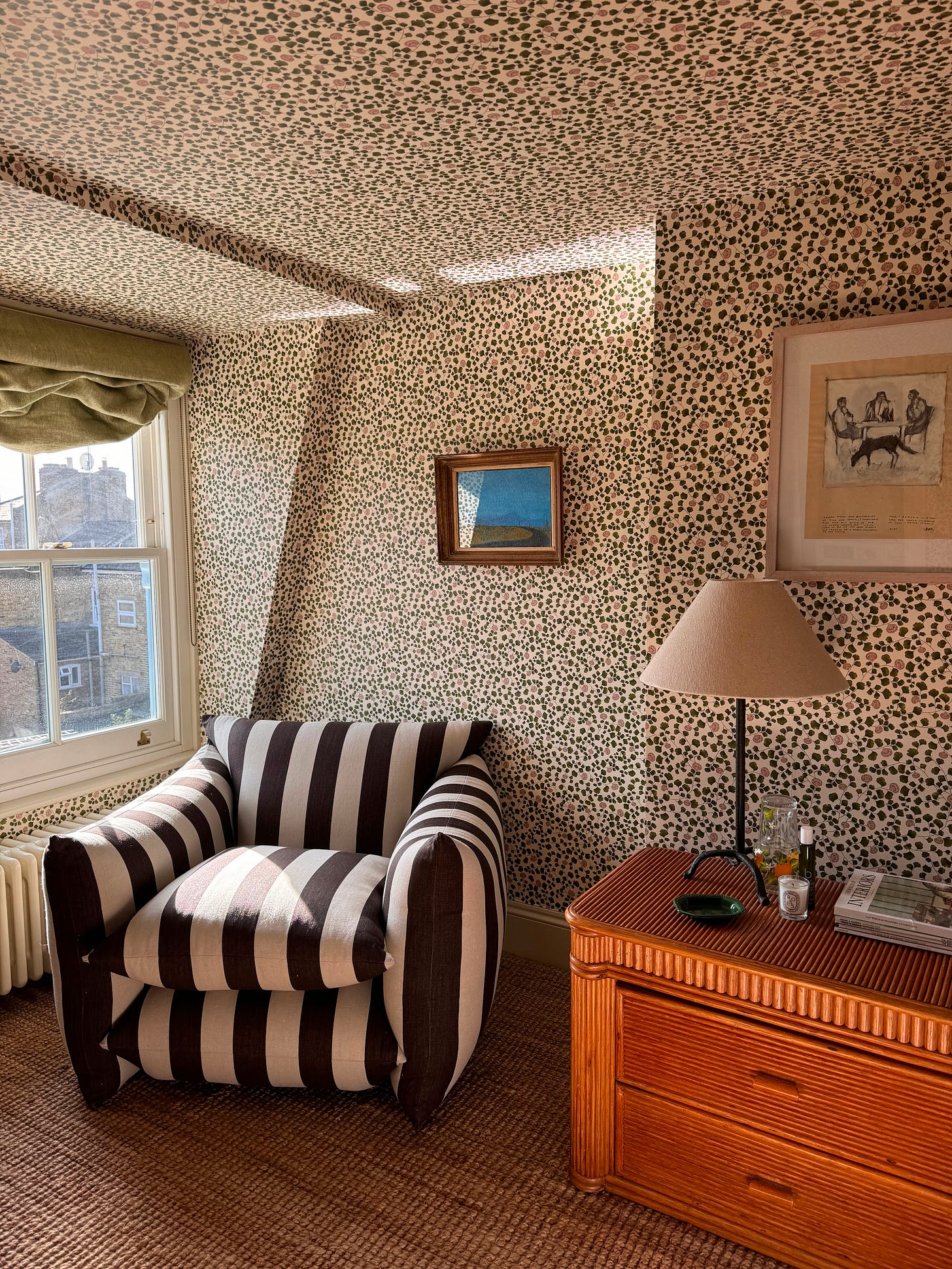
I was recently trying to tweak our spare/guest room because it was just feeling a bit too flat and predictable, but it quickly became a game of unsatisfying jenga as I tried to take one thing out and add another without letting the whole room metaphorically (hopefully!) crumble. I took the chair out of it and the room felt lost. I tried switching up the lamps in there and nope, that didn’t work. I tried mixing up the art and still no… I was at a loss.
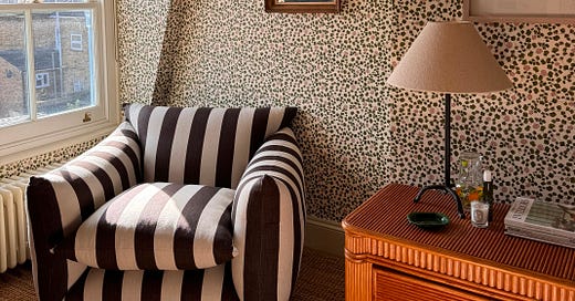
Eventually I got there, or least I’m part way there… The pretty Living Quarters wallpaper needs dark wood and bold stripes to keep it balanced and anything remotely pretty, feminine or remotely zeitgeisty feels too much in there. I added more chunky stripes in the form of a Buchanan Studio chair, a new piece for art in a bright blue that the room hadn’t had before and started concepting a bold, red headboard for the room.
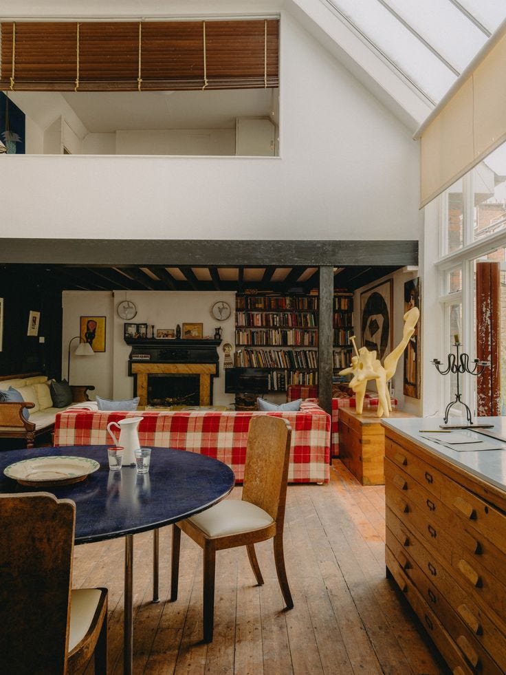
But the conundrum of this room got me thinking about rooms that are almost too perfect. I know that sounds like an oxymoron but bare with me. My two favourite rooms in the house (our interconnecting sitting rooms) are the opposite of this. I can throw anything at them and it sticks. I could change the colour of the sofa, the fabric on the ottoman, the art, the rugs and the rest of the room would, for the most part, still work. I love rooms like this. Rooms that never quite feel full or finished and can take plenty of tinkering.
The phenomenon of the ‘too perfect’ room is perhaps when everything in it is too universal, too easy and too inoffensive. In every room I love, there will be something in there that a lot of people might not choose or even like, something a teeny bit divisive whether that’s art, a choice or fabric or a penchant for ceramic vegetables and horses - ok maybe that last one is quite specific to me and me alone. Because if everything in a space is subjectively ‘nice’, ‘fine’ or perfectly coordinated (case in point my spare room pre-tinkering), it can feel static and a bit, well bland. Here are some signs you might have a too-perfect room on your hands;
You take anything out or put anything new in and the whole thing starts to jar.
You notice if the slightest thing is out of place.
You constantly feel like the room is missing something or not finished but equally nothing else works in it.
You like everything in it but it doesn’t make your eyes happy or your heart sing
It never feels entirely cosy/relaxing/energising - delete as applicable depending on the room - but isn’t missing anything obvious or useful.
So if you find yourself in this rock and hard place when it comes to decorating, these tips might help you break through and break-free…
Give your eye things to cling onto
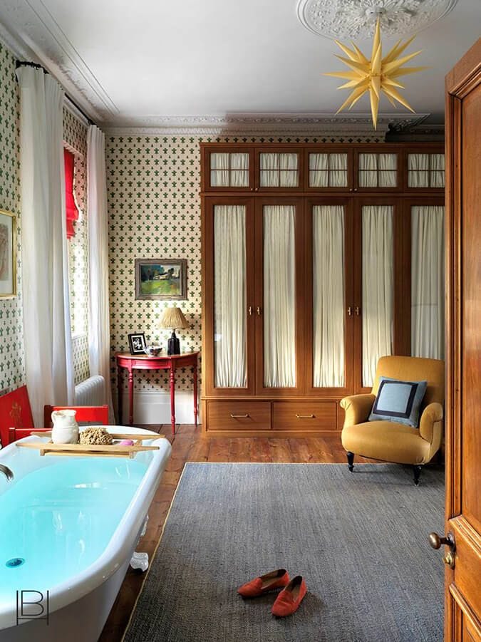
Rooms need contrast, be it in texture, colour or aesthetical styles, to be pleasing. Not many of us want to live in a white box with a white sofa. I mean, I like blue but I don’t want to live in an entirely blue box with matching blue sofa. We need layers and points of difference. This can be one fantastic piece of art in an otherwise muted room or a richly layered room with lots of different fabrics and knick knacks. If one new thing is making things jar, try adding in two new things and see if that helps. Sometimes more really is more.
Learn to shop on impulse (a little).
Slow, mindful shopping is the goal in so many ways and with my wardrobe it’s definitely what I could do better at. But when it comes to homeware, I’m a big advocate for buying little things you like when you see them. It’s the bits and bobs that often make a room complete but are hard to find when you really want or need them. ‘Stuff’ is the shoes and jewellery of interiors; without it, it feels like something’s missing but hard to find exactly what you need when you’re putting a look together. It’s something you need to build and collect. I think people will often pick up a little pot or a bowl in a vintage shop or independent store and question where it would go or what it’s for and without an instant answer, they put it back. But it’s little things we might see and love that will end up on a shelf or a mantle that takes a room from ‘too-perfect’ to just right.
Step away from the high street and never have more than one thing from a single store in a room at a time.
The high street has some real gems on it, no one is denying that. But it’s way too tempting and convenient sometimes to buy multiple pieces of furniture from the same store or chain and then wonder why your space doesn’t look like all the inspiration pics you saved on Pinterest. Try setting a rule for yourself that you’re not allowed more than one piece from the same retailer in the same room. If you get your sofa from Sofa.com get your ottoman from somewhere else. Get the bed from Soho Home but go vintage for the nightstands and mirrors. Sometimes pushing past the easy option pays dividends by the end result.
Keep reading with a 7-day free trial
Subscribe to Remotely by Lucy Williams to keep reading this post and get 7 days of free access to the full post archives.


