We’ve offically lived in our house for 2 years now since renovating it from top to bottom. After a year of finishing, snagging and filling it with stuff, followed by another year of total decision fatigue and just enjoying it, we’re now at the stage where things need repairing and perhaps, reassesing. FUN! If you can’t tell, that is pure sarcasm because having to spend money replacing or repainting after spending alllll your money on the whole bloody house just a few tax returns’ ago feels like biting on a lemon. But making lemonade out of lemons and all, I figured it is the perfect excuse to do a little coulda woulda shoulda exercise and imagine what I’d do now if I had my time again, which might be inspiring to anyone just starting out creating a home. A lot of people message me asking ‘but where do I begin?!’ and this is (hopefully) the kind of juices-flowing stream of consciousnes that might just kick start something in your psyche.
I’ve really tried to stick to the frivolous, fun stuff rather than getting into the nitty gritty and technical stuff but there are a couple of those if that’s helpful!
So without further ado, here’s what would be crowding my moodboards and pinterest if I was designing a home now and if anyone with lots of trust and a blank canvas thinks this all sounds great, hire me haha!
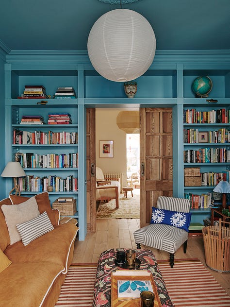
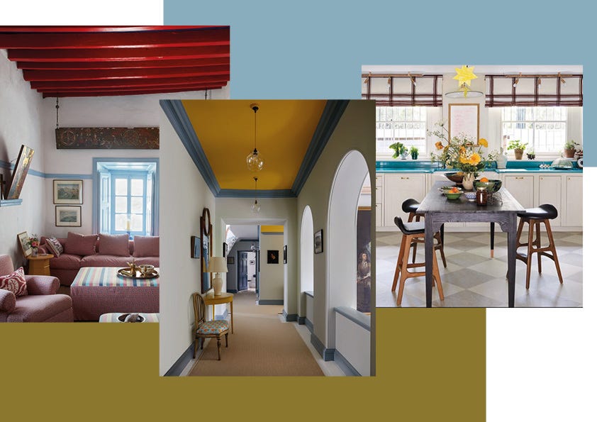
I’d have at least one statement painted ceiling
I love the idea of flipping the old coloured walls/white ceiling thing (hate hate HATE) on it’s literal head and doing white walls with a bold ceiling that extends down to where a traditional picture rail would be. I’m imagining a cobalt blue or crimson red maybe. Painted ceilings feel so enveloping and atmospheric but you still get the clean white walls look for a room that can take it. And bonus points, it reminds me of John Stefandkis’ Patmos homes which are constant bubbling away in my subconscious in terms of inspiration. I was going to do this in our sitting room but in the end, felt like there was so much going on in there, it didn’t need it. So yeah, next time!
I would get personal recommendations for plumbers/electricans, not just sub contractors
Ok one quite boring one but maybe helpful. Ye the pretty things are lovely but when the water pressure isn’t what you thought it would be or you’re snagging light fittings for a year, you will be annoyed and no amount of nice marble can soften the blow. Of course hiring a good builder to manage your project requires putting trust in the contractor’s team but if said team is a revolving set of sub-contractors who might not have worked on previous client’s projects you got feedback on, it might be worth getting a second opinion. Electricians and plumbers are notoriously the most in demand trades and they really can make or break a project in so many ways so for these two key elements, I would bring in the A-Squad - whoever they are!
I’d use lava stone for my kitchen surfaces
This is not a cheap option granted, but it is an incredibly durable one which definitely counts for something. I did know about this while doing our kitchen but the dark brown marble won in the end (which I do still adore, even if it is wildly impractical at times). Anyway I’ve become more and more enamoured with this stuff recently; it’s heat resistant, scratch resistant and comes in a myriad of colours. You can even make your sink out of so the whole think flows. Dreamy!
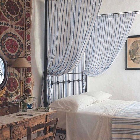
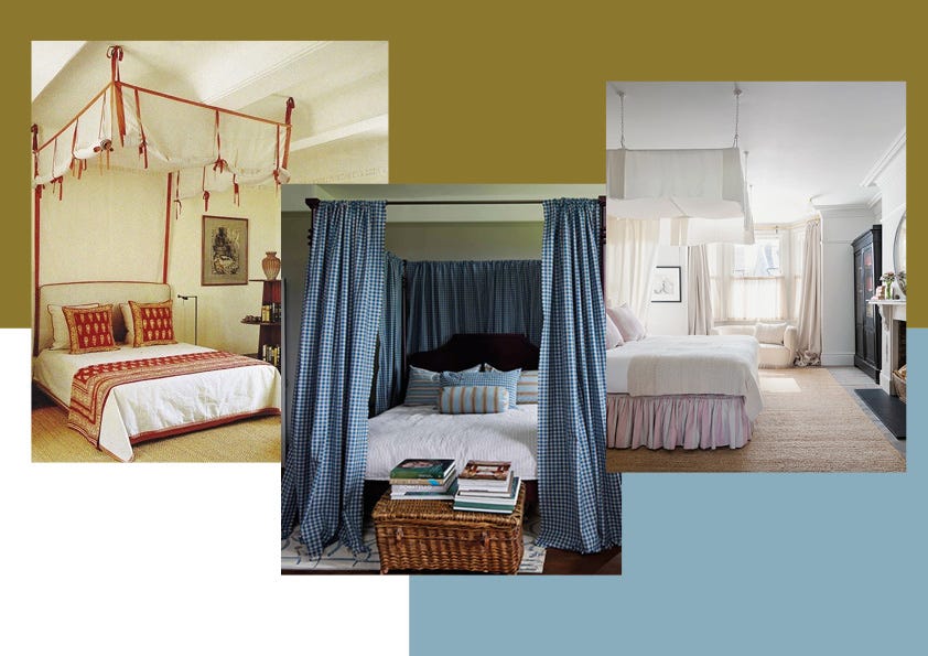
I’d have a four poster bed or a canopy
I mean this a fantasy list so why not a fantasy bed. I love the romance of a four poster bed (who doesn’t) or just a ceiling-hung draped canopy which would probably be more suited to the size and height of our bedroom and would chose this over a headboard now. You can get so much impact from this alone, the rest of the bed can just be super neutral and mellow which I love. Canopies look super luxurious and hotel-like but can actually be really budget-friendly depending on what fabric you go for. I love Nix by Nicola Harding’s four poster bed as a beautiful last-a-lifetime option.
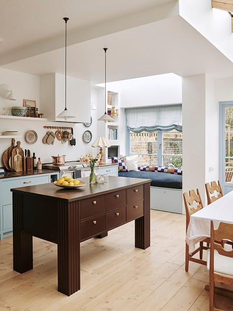
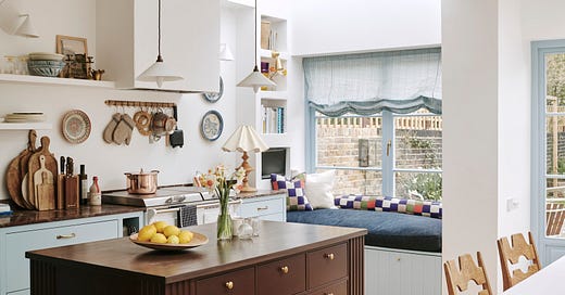
I’d have a neutral kitchen (maybe)
I actually feel disloyal to our pretty blue kitchen saying this, but yes I think I would go more neutral …maybe. Like a nice, sandy-beige colour perhaps. I just adore Pernille Lind’s warm, sandy kitchen and a few more I found on Pinterest. I would definitely still incorporate colour but maybe through a separate cabinet, island or dresser. I still love our kitchen so much but I think if I was doing now, I would go down a different avenue of my brain.
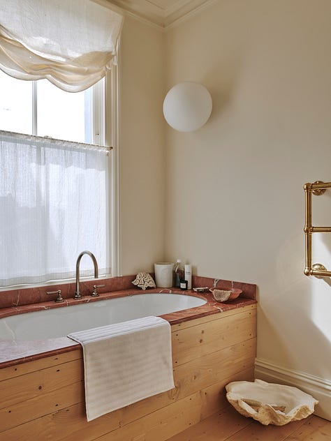
I’d get a really deep bath
One thing that really upsets me in our house (*pause for eye-roll at my self-indulgent melancholy) is how shallow our bath is. I know, I know, pull myself together but in my defense I am a petite-ish person (5ft 5) and I can’t lie in our bath without a knee or both feet protruding. I love the look of an inbuilt bath and love our red marble/wood clad bath but in reality, it is not the deep trough for wallowing in I wish it was. I like a bath I can fully submerge myself in with just a nostril poking out above the surface, so next time I would really get in said bath and try it out and not just look at measurements. But you know, lots of decisions, limited brain space at the time so I try and give myself slack for this one.
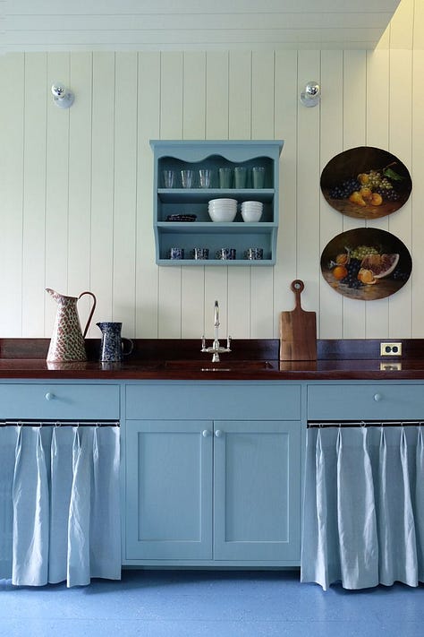

I’d match counter curtains to cabinets
Perfectly demonstrated by Peter Dolkas above in that mid Dutch blue I love so much. I love the idea of matching counter curtains to the cabinetry for a less cottagey, more sleek take on the cabinet-curtain trend. Imagine this in a stony yellow or an earthy brown. Plus it opens up more places to add in stripes and pattern without it all getting a bit too much. To be honest I love matching curtains and walls already - both our bedroom and snug do this to some degree and I love it. See also, matching curtains and wallpaper for a nod to chintz; I love Beata Heuman’s range of fabrics and wallpapers to do this perfectly.
Oxblood would be my go-to colour
I used a little bit of this on our staircase but if I had my time again I would probably have to be restrained from painting a lot of things in this colour. Favourites I’ve found so far are Farrow and Ball Estrucean Red (in north or east facing rooms), Little Greene’s Baked Cherry and and Paper and Paints Porphyry Red which is the colouir of our staircase. Even more wow in a high-shine gloss.
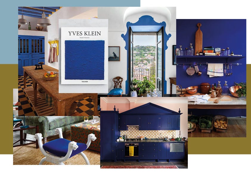
I’d Utilise This Klein-esque Shade of Blue
I think this is the evolution in my love for all things blue. It’s a little bit 90s Conran, a little bit Bohemian villa in Tangiers and just very pleasing. I love the idea of painting a trim or doorframe in an off-white room or using it in a velvet or mohair for upholstery. A kitchen island would be incredible in this and it looks amazing with timber and stainless steel. I like that it’s bold but can still work with my style and hasn’t been done a million times over. Anway, time to find a stool or a table to turn blue!
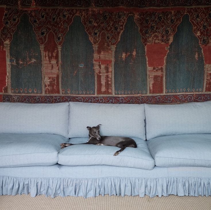
I’d have an Armless Sofa Somewhere
Ok, quite random and I wouldn’t do for our main TV-watching sofa but I’m just obsessed with a slightly frilly armless sofa right now. I’ve always love Soane’s take on this classic country house-esque piece but Maro At Home’s custom creation for Mad Honey recently just totally won me over.
And now for a few things, I maybe wouldn’t do now….
1. I (might) not have pine flooring in my kitchen
This is paining me because I still LOVE our wooden floor. The look and feel of it is perfect to me and thankfully I’m not someone that’s very triggered by small bumps, scratches and marks (and it really does mark and dent just FYI). However, I will say the discolouration of it in our kitchen thanks to an abundance of sunlight is bothering me. I posted about it on my instagram stories recently and the verdict seems to be the whole thing will need re-sanding, re-treating and sealing to get it back to its original ashy but warm look so I’m building up my energy and finances to do this. Raw pine is definitely my favourite timber for flooring in terms of tone and look but the softness and yellowing of it is less that ideal…
2. I wouldn’t have soft roman blinds
The quality of all our curtains and blinds made by East London Cloth is *chefs kiss* and I love the feel, weight and construction of all of them. I just wish I hadn’t specced a soft roman blind in our kitchen now. It just feels a bit too twee and whimsical for the space perhaps. I’m looking into how big a job this might be to change!
3. I wouldn’t have anything wiggly or wavy.
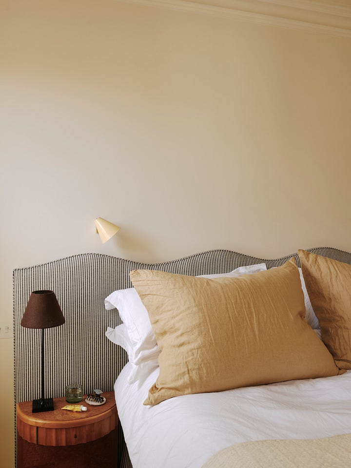
Maybe this is why I’m not into my kitchen blind anymore! I still like our head board but I wouldn’t do it now and while I do still enjoy a playful nod to waves and curves, be it via a lamp, table or bowl, I wouldn’t go inbuilt with it now. Scallops is a total no-no for me and always has been to be honest.

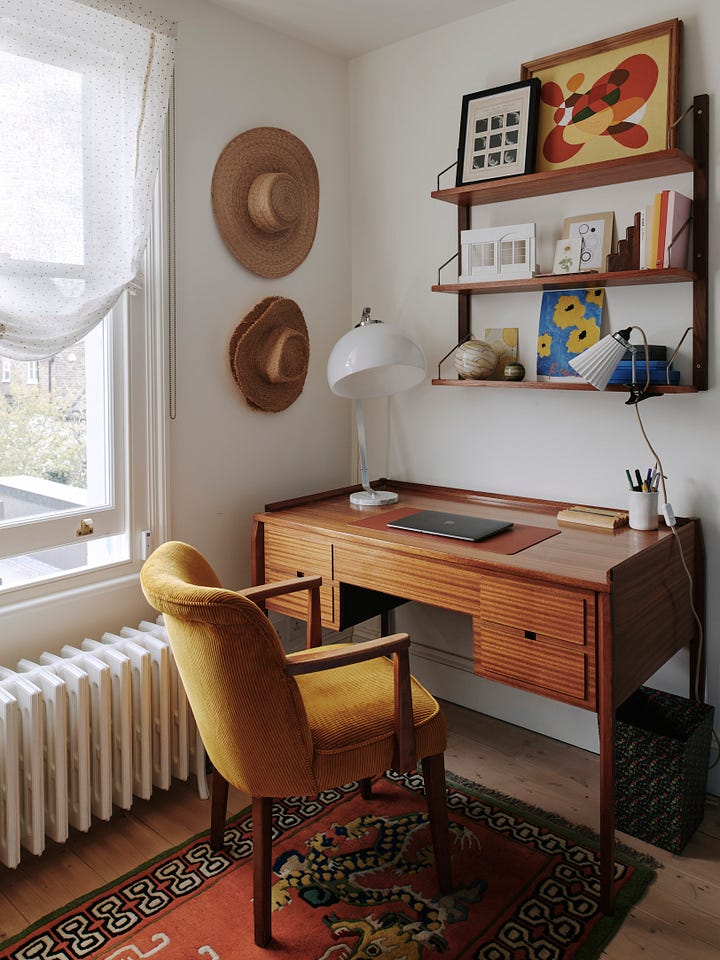
4. I wouldn’t do a dedicated home office in the same way again.
When you’re lucky enough to have more than one spare bedroom, one inevitably ends up being a study. However, I always, without fail, end up working at the kitchen table and our carefully curated office is just essentially a dumping ground for junk, stuff waiting to be donated or returned and a base for occasional zoom calls for my husband. If you’re someone who genuinely likes a dedicated work space at home (I imagine with kids it’s a must) it’s a space well-utilised but I now realise I work much better in our light, bright kitchen with tea on tap than tucked away upstairs. I still like to think at some point I might use said office diligently so it might come into it’s own, but for now it kind of feels like wasted space in some ways.
5. I wouldn’t risk vintage taps
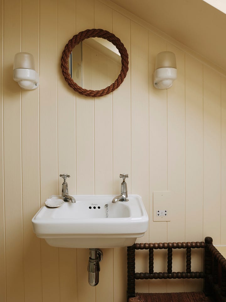
I hate to throw shade at shopping secondhand because honestly, it’s the best and most-rewarding way to fill a home but *gritted teeth* I have had some issues with vintage taps. Vintage taps can look so lovely and stop a brand new bathroom or kitchen from looking clinical in an instant. But I’ve already had to replace one set of mine so the whole thing has felt like a bit of a false economy in terms of both money and time which is a shame.




Obsessed! What a fun read. I am also swooning over ceiling-hung draped canopies lately. Such a simple (yet romantic) way to elevate a room!
Love this!